Power Full Kids
Interactive Educational Website Design (2022)
Built the digital hub for Power Full Kids™, empowering 997K students across 2,186 schools to learn essential food skills through playful, accessible, and interactive design.
997K
2K+
15%
1.5K+
Overview
Power Full Kids is a flagship initiative of the President’s Choice Children’s Charity. This program integrates existing food access initiatives aimed at combating childhood hunger and alleviating poverty with proprietary educational content. The educational component focuses on teaching children essential skills in growing and cooking food, thereby advancing their education and promoting self-sufficiency.
My role
Project type
Interactive website design
Personality
Playful, engaging, educational, imaginative
Creative Director
Karim Youssef
Lead Developer
Wade Hunter
Website link
What i did
Problem
Current school programs rely extensively on traditional learning tools such as physical papers, books, and written assessments, requiring educators and students to be physically present in school. While there are digital resources available, such as educational videos and PDFs, they are often scattered, lack engagement, and lack a unified, cohesive platform.
Objective
Create a centralized digital learning platform that teaches kids how to grow and cook food in a fun, accessible, and structured experience that supports educators.
Target audience
Primary Users: Primary: Students ages 6 to 12
Secondary Users: Educators and school administrators
Empathize
Understanding User Needs
Research methodologies
Performed landscape analysis on existing learning platforms
Interviewed educators and students
Landscape Analysis
While there were no direct competitors offering a platform that combines food literacy, gamified learning, and educator tools, we reviewed existing solutions to understand how similar problems are addressed.
What We Reviewed
DIY.org — gamified challenges, badges, and community-based learning
Spongelab — interactive games with educator lesson tools
Khan Academy Kids — structured lessons with interactive content and teacher support
User Interview
To complement our understanding of the market, we conducted user interviews to uncover real classroom behaviors and challenges. We interviewed 6 participants (3 educators and 3 students) to understand what worked and what did not in their current learning experiences.
User interview goals
Identify what motivates children to complete lessons
Understand educator challenges in creating and delivering content
Evaluate current tools and where they fall short
Identify opportunities for playful, self-directed learning
User stories
We synthesized interview findings into user stories to capture key user needs and behaviors.
As a student, I want to learn through interactive, game-based experiences so learning feels engaging
As an educator, I want to create lessons with simple templates so I can deliver consistent content quickly
As a student, I want all lessons and activities in one place so I don’t have to switch tools
As a student, I want to collaborate with classmates so we can learn together
As a student, I want to track progress and personalize my profile so I stay motivated
Define
Aligning Insights for Direction
Key insights from research
We analyzed these user stories alongside research findings to identify patterns and recurring challenges.
Students stay motivated when learning is hands-on, enjoyable, and tied to real-world outcomes
Educators need a simple and centralized way to build and share consistent content
Multiple tools create a fragmented experience and confusion
Collaboration improves engagement and peer-to-peer learning
Personalization and progress visibility help build confidence and pride
Existing platforms tend to focus on either engagement or structured learning, reinforcing the gap for a unified solution.
Personas
With a clear understanding of user needs and challenges, I moved into defining who we are designing for and aligning key insights into a focused product direction. This step helped ensure our decisions were grounded in validated patterns rather than assumptions. These personas reinforced key patterns around engagement, structure, and accessibility, helping prioritize features for both students and educators.


Ideate
Planning the Right Solution
Checking project goals
Building on these user needs, we aligned them with business goals to define a clear direction for the platform. This ensured that every feature we designed not only supported engaging learning experiences, but also advanced the program’s mission to promote food literacy and long-term self-sufficiency.

UX strategy
With a clear understanding of student and educator needs, we developed a platform strategy focused on improving engagement, consistency, and accessibility in food education. The goal was to create a single digital experience where students can explore food through play while educators can confidently deliver structured lessons. Each strategy directly addresses key insights identified during research.
Introduce gamified and interactive learning to keep students engaged
Enable fast and consistent lesson creation through templates for educators
Centralize lessons, games, and assessments into one unified platform
Support collaboration through group-based learning and shared activities
Encourage motivation through personalization, progress tracking, and rewards
Translating needs into features
These strategies directly informed the features and interactions designed in the final product.
Design
Visualizing the Experience
Site map
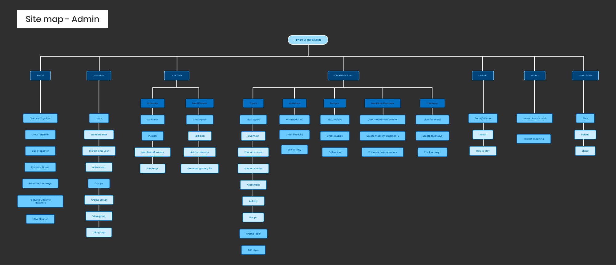
To communicate the overall structure without overwhelming detail, this high-level site map outlines how key features and content areas are organized across the platform for both students and educators.

IA and lo-fi wireframe
Design began with a combined IA and low-fidelity wireframe approach to accelerate collaboration with developers while validating structure and functionality early.
Design System
A scalable design system was created to align with PCCC branding while remaining playful, accessible, and visually friendly for children. Custom illustrations and animation reinforce delight without overwhelming comprehension.
Noir Std
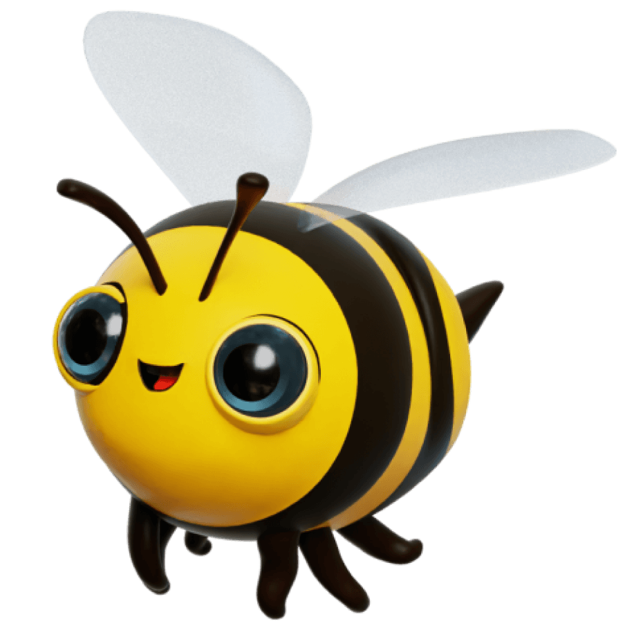
Sunny is a cheerful and carefree bumblebee with a passion for growing and cooking food. Sunny's ultimate dream is to open his own restaurant where he can share his love for delicious, homegrown meals with the world.
Final Design
01. Interactive landing page
To create an engaging first impression, the landing experience uses interactive elements and 3D animations to draw students in and encourage exploration of different learning topics.
02. User dashboard and personalized avatars
To support personalization and ownership, users can choose avatars and access lessons, groups, and achievements in one centralized dashboard, simplifying navigation and reinforcing a sense of progress.
03. Group collaboration & management tools
To encourage collaboration and social learning, users can create and manage groups, track shared activities, and monitor progress across participants.
04. Achievement badges
To increase motivation and completion, users are rewarded with badges for completing lessons, recipes, and games, reinforcing engagement through recognition.
05. Templatized lesson builder
To reduce educator effort and ensure consistency, lessons can be created using pre-designed templates that maintain structure, readability, and brand alignment.
06. Calendar Integration
To support organization and accountability, users can schedule lessons, activities, and assessments within a shared calendar.
07. Foodways explorer
To connect learning to real-world context, users can explore the cultural and geographical origins of food through an interactive map and timeline.
08. Interactive meal planner
To apply learning to everyday behavior, users can create and customize meal plans that generate grocery lists, reinforcing practical food skills.
09. Cloud drive
To centralize resources and reduce fragmentation, users can store, access, and manage all educational content in one place.
Test & Iterate
Refining Through Feedback
Usability testing
Given time constraints, we moved directly into development and used the first coded build as our working prototype. This allowed us to test real interactions early and identify usability issues in a more realistic environment.
Testing Approach
We tested the experience with five participants:
3 students (ages 8–11)
2 educators
All sessions were conducted remotely through video calls, where participants shared their screens while completing guided tasks.
Testing Objectives
We aimed to evaluate:
Whether users could navigate the platform without guidance
How clearly users understood lesson structure and progress
If educators could quickly find and manage content
How intuitive the overall experience felt for first-time users
Finding #1
Navigation lacked clear structure and hierarchy
All navigation items were displayed in a single long list with no grouping or hierarchy. Users, especially educators, struggled to quickly locate pages, leading to cognitive overload and slower task completion.

Design iteration
Navigation was reorganized into collapsible categories such as User Tools and Content Builder, creating clearer structure and reducing visual clutter.

Iteration impact
Faster navigation and improved wayfinding
Reduced cognitive load
Fewer navigation errors during testing
Finding #2
Lesson progress lacked clarity and detail
Lessons included Intro, Activities, Recipes, Educator Notes, and Assessments, with some sections containing multiple activities. The progress bar only reflected high-level categories, so users remained on the same step even when progressing through multiple activities, causing confusion.

Design iteration
The progress bar was redesigned to display the number of items within each section, clearly showing the user’s current position and what remains.

Iteration impact
Clearer understanding of progress
Increased confidence and motivation
Improved navigation through lesson content
Impact
Product impact
By combining gamified interactions, structured lesson flows, and improved navigation, the platform transformed food education from a fragmented, paper-based experience into a centralized system that encourages active participation while simplifying content delivery for educators.
User outcomes
Increased student motivation through interactive learning
Improved educator efficiency with templated tools
Greater consistency in lesson quality across classrooms
Stronger engagement through collaboration
Broader impact
Enabled the program to scale beyond physical classrooms, making food literacy more accessible and engaging across diverse learning environments.
Learnings
Working with real-time 3D animation taught me the importance of balancing visual impact with performance and usability. While 3D elements can enhance engagement, they also complicate the workflow and risk overshadowing core functionality. Prioritizing structure and usability first ensured the platform remained accessible and intuitive especially for younger users while allowing room to layer in rich, immersive visuals that supported the learning experience.
Awards
Gold
ADDY Awards - AAF Dallas
Category: Consumer Website