Toyota Crown
Interactive WebGL Virtual Showroom (2023)
An immersive WebGL showroom combining luxury and innovation to redefine the Toyota Crown experience.
9
3K+
7K+
65%
Overview
In 2023, Toyota launched the Crown with a need to educate dealers and engage customers through a digital-first experience. The solution needed to bridge the gap between online exploration and in-person sales.
My role
UI/UX Designer, Art Director
Project type
Responsive website design
Personality
Premium, reliable, bold, sexy
Creative Director
Karim Youssef
Lead Developer
Kris Sorensen
What i did
Problem
Dealers lacked an engaging, scalable way to learn and communicate the value of the Toyota Crown, while customers found traditional car research static and uninspiring.
Objective
Design an immersive WebGL experience that enables dealers to effectively learn and communicate the Toyota Crown, while giving customers an engaging way to explore the vehicle digitally.
Success Criteria
Reach 2,000 dealer engagements within 2 months
Achieve 60%+ interaction rate within the experience
Target audience
The experience was designed primarily for dealership personnel, with customers as secondary users engaging alongside or independently.
Empathize
Understanding User Needs
Research methodologies
To design an effective experience, we combined industry analysis with direct user research to understand both workflows and user behavior.
Competitive analysis (Lucid, Mini, Rivian, Range Rover)
User interviews with Toyota dealers and customers
Competitive analysis
We evaluated existing configurators to identify gaps in supporting dealer-led experiences.
How do configurators support or limit dealer conversations?
Where do users experience friction or overload?
How is information structured and explained?
User interview approach
To better understand real-world behaviors, we conducted four remote interviews via video call with two Toyota dealership personnel and two potential customers. These sessions helped us uncover how dealers present vehicle features and how customers explore and engage with vehicle information before and during dealership interactions.
User interview goals
To better understand user needs, we focused on key questions around dealer workflows and customer engagement.
How do dealers learn and explain vehicle features?
What challenges do they face during conversations?
How can digital tools better support this process?
User stories
We identified key needs centered around dealer enablement and customer support.
As a dealer, I want a simple and engaging way to explain features so that I can clearly communicate value to customers.
As a dealer, I want to guide customers without memorizing specs so that I can have more confident and natural conversations.
As a dealer, I want to quickly switch between trims and features so that I can compare options in real time.
As a dealer, I want a tool that works well on a tablet so that I can use it easily during in-person interactions.
As a customer, I want to explore the car before visiting a dealership so that I feel more prepared and confident.
As a customer, I want to see the car in realistic environments so that I can better imagine owning it.
As a customer, I want a simple, guided experience so that I don’t feel overwhelmed by too many options.
As a user, I want clear guidance on how to interact with the 3D experience so that I can explore it confidently.
As a user, I want a seamless experience across devices so that I can continue exploring without friction.
Define
Aligning Insights for Direction
Key insights from research
We synthesized findings from the competitive analysis and user interviews to identify key opportunities that informed our design direction:
Dealers need a guided but flexible flow to support conversations
Too many options create cognitive overload
Existing tools focus on selection, not storytelling
Static content limits engagement and clarity
Users need guidance in 3D interactions
Seamless performance across devices is essential for in-dealership and at-home exploration.
Lack of context reduces emotional connection
Personas
To validate these insights and ensure they reflected real user needs, we developed personas representing our primary and secondary users.


Ideate
Planning the Right Solution
Checking project goals
Before moving into solutions, I aligned what dealers need to effectively communicate the Toyota Crown with what Toyota aims to achieve through this experience. This ensured every feature supported both dealer enablement and customer engagement.
UX strategy
We focused on reducing decision fatigue, improving feature understanding, and creating a seamless cross-device experience. These strategies were designed to help users confidently explore the Toyota Crown while staying engaged across desktop, tablet, and mobile.
Guide users through a flexible, step-based flow
Surface key decisions at the right moment
Use 3D interactions to simplify feature understanding
Design tablet-first for in-person dealer use
Adapt layouts seamlessly across desktop and mobile
Provide clear cues for intuitive 3D navigation
Enable real-time trim and feature comparison
Use contextual environments to build connection
Balance education with visual storytelling
Translating needs into features
With the UX strategy defined, we translated key user needs into core features. These features directly translate the UX strategy into tangible interactions.
Design
Visualizing the Experience
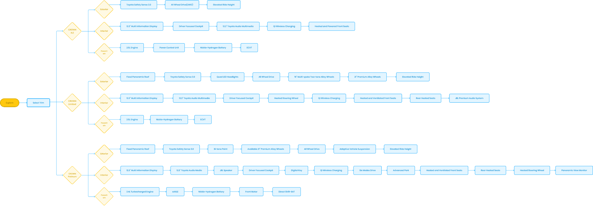
UX flow
The experience follows a guided journey from discovery to understanding. Users begin with a vehicle reveal, move into trim and color selection, explore interior and exterior features, and learn about performance. The flow supports exploration without overwhelming users.
Low-fidelity wireframe
Wireframes were created to define layout, hierarchy, and interaction patterns across tablet, desktop, and mobile. The focus was on clear navigation, touch-friendly interactions, and consistency across screens.

Low-fidelity Prototype
Design system
A lightweight design system was developed to support the experience. It focuses on minimal UI, readability, and scalable components while keeping the 3D content central.
Aa
Toyota Type
Toyota Red
#EB0A1E
White
#FFFFFF
Gray
#58595B
Black
#000000
Exterior
Exterior
Exterior
Exterior
Final design
Landing Page
To create a strong first impression and draw users in, the experience begins with a cinematic silk reveal, introducing the Toyota Crown in 3D. This moment establishes a premium tone and invites users to begin exploring.
Trim selection
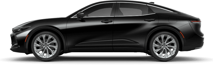
To enable quick comparison and reduce friction, users can rotate the vehicle and switch between trims, including XLE, Limited, and Platinum. Each selection updates the model in real time, allowing for quick and intuitive comparison.
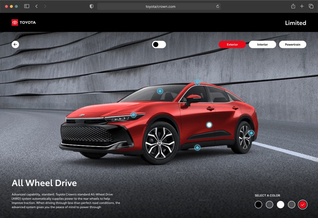
Exterior
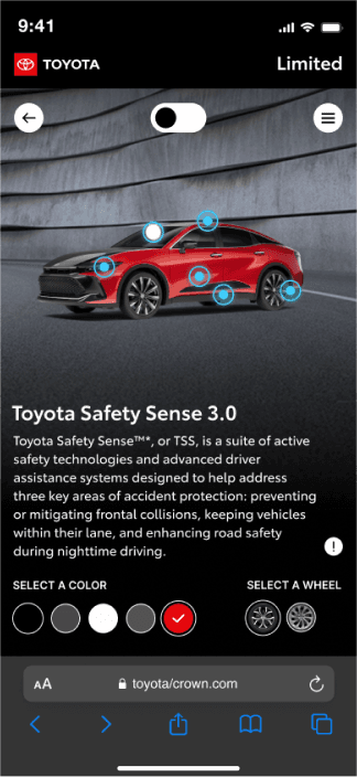
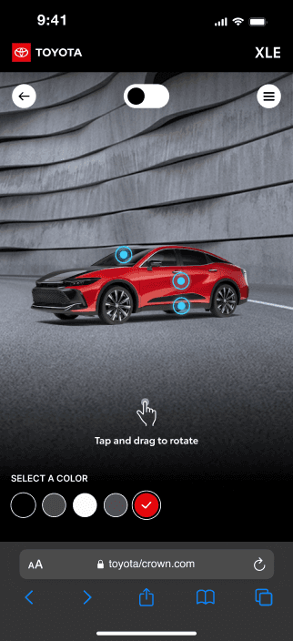
To focus on high-impact customization without overwhelming users, users explore the exterior through rotation and interactive hotspots highlighting key design elements. Color and wheel options allow for quick personalization.
Interior
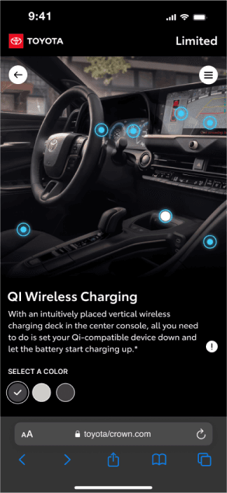
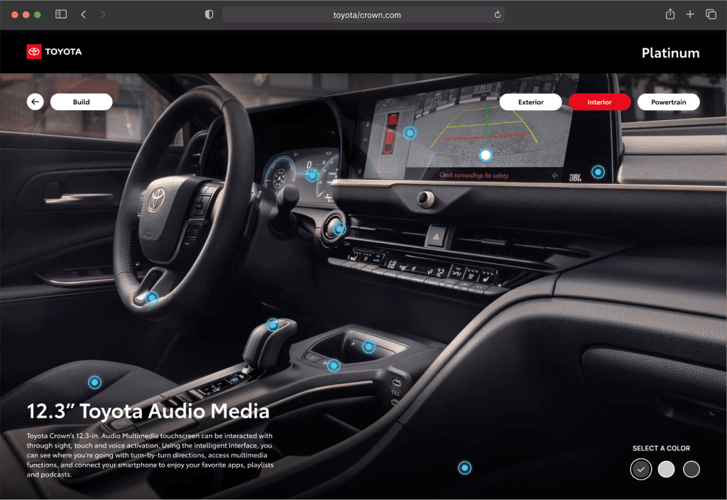
To improve spatial understanding and make features feel tangible, a 360° interior view lets users explore the cabin through interactive touchpoints. Key features are highlighted visually, with options to customize interior finishes for select trims.
Powertrain
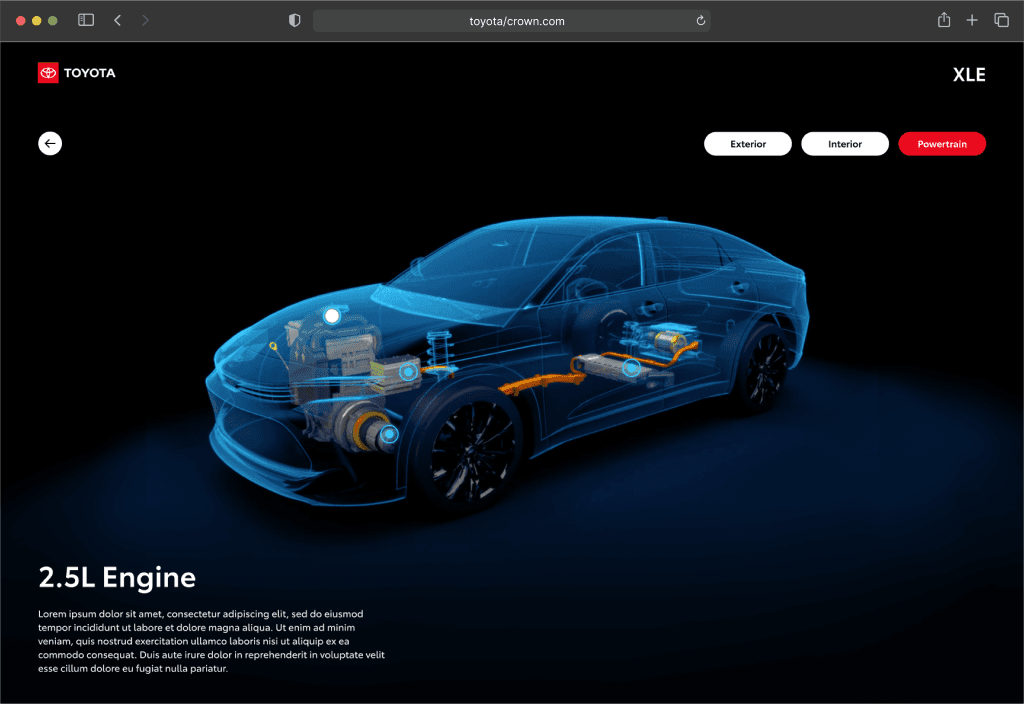
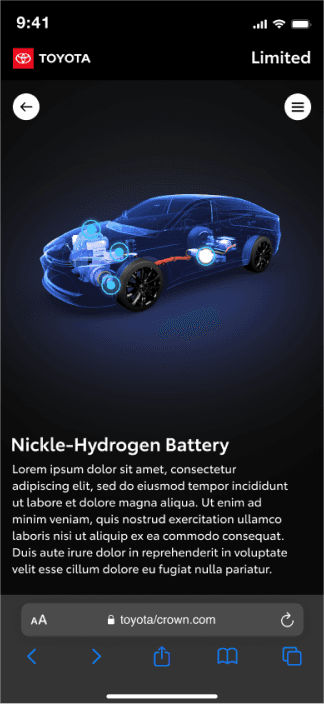
To simplify complex technical information, interactive touchpoints guide users through Toyota’s hybrid system. Information is presented visually to highlight key differences and benefits across trims.
Loading animation
To provide clear feedback and maintain engagement during load time, a custom loading animation was designed using the Toyota Crown wheel, reinforcing brand identity while indicating progress.
UI motion mockups
To ensure smooth, intuitive interactions and consistent behavior, motion studies were created to guide development, focusing on transitions, easing, and interaction states such as idle, hover, and active.
Test & Iterate
Refining Through Feedback
Usability testing
To validate our design decisions, we conducted usability testing with both dealers and customers to understand how the experience performs in real-world scenarios.
Testing approach
We tested the experience with four participants:
2 dealership personnel in a dealership setting
2 customers in a controlled studio environment
Testing objectives
We aimed to evaluate:
Ease of navigation across trims and feature sections
Clarity of interactions within the 3D environment
Efficiency in comparing trims and features
Overall usability across different devices
User confidence during exploration
Finding #1
Navigation friction
Users moved linearly from trim → exterior → interior → powertrain, creating too many steps and making it difficult to compare trims efficiently.
Design iteration
Introduced tab-based navigation (Exterior / Interior / Powertrain) immediately after trim selection, allowing users to switch seamlessly between sections.
Iteration impact
Onboarding time improved by 40%, resulting in faster interaction and a smoother, more confident exploration experience.
Finding #2
Lack of clarity in 3D interaction
Users hesitated when entering the 3D experience and were unsure how to interact with the vehicle, leading to delayed engagement.


Design iteration
Added subtle animated gesture cues paired with short instructional text to guide users on how to interact (swipe, drag, tap).


Iteration impact
Onboarding time improved by 40%, resulting in faster interaction and a smoother, more confident exploration experience.
Impact
Over 3,000 dealer personnel in the U.S. accessed the digital showroom, strengthening product understanding.
Globally, more than 7,000 dealer personnel accessed the site.
Approximately 65% of those users engaged with the content.
These results demonstrate that the experience successfully scaled dealer education, improved engagement with the Toyota Crown, and provided a more effective way for dealers to understand and communicate the vehicle’s value
Learnings
Designing for WebGL reinforced the importance of balancing performance, usability, and visual fidelity in immersive experiences.
Simplifying interfaces and interactions helps maintain performance and prevents breaking immersion across devices
Early and continuous collaboration with developers and 3D artists is critical to aligning design with technical constraints
Clear guidance and iterative testing significantly improve user confidence in unfamiliar 3D environments
Immersive experiences are most effective when they feel both engaging and intuitive, without sacrificing clarity or speed
Awards
Gold
2023 Davey Awards
Category: Automotive
Platinum
2023 Vega Digital Awards
Category: Website & Mobile Sites – Automotivee
Platinum
2023 Vega Digital Awards
Category: Website & Mobile Sites – Best Use of Emerging Technology
Grand
2023 NYX Marcom Awards
Category: Website – Automotive
Gold
2023 NYX Marcom Awards
Category: Website – Green / Eco-Friendly
Platinum
2023 Hermes Creative Awards
Category: Electronic Media / Social Media / Interactive Media | Web Creative
Platinum
2023 Hermes Creative Awards
Category: Electronic Media / Social Media / Interactive Media / Website Overall
Platinum
2023 Muse Creative Awards
Category: Website – Sustainability & Environment
Platinum
2023 Muse Creative Awards
Category: Experiential & Immersive – Promotions & Stunts